Fine Art Collections
Women of the Bible
Heroes of the Book of Mormon
Pioneer
High Valley
The Messiah
Limited Edition Lithography
Temple Art
Publications
The Storybook Home Journal
Bimonthly literary publication since 2000
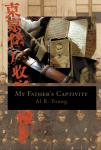
My Father's Captivity
Historical narrative published in 2009
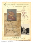
Seymore Wainscott Papers
Colonial American fiction series since 2008
Sheet Music
Available since 2010
Home
·
Fine Art Gallery
·
Publications
Newsroom
·
About
·
FAQ & Privacy
·
Contact
Cart: 0 items